Relaxing rebuses
What we did
  • Research
  • Competitor Analysis
  • App Icon Redesign
  • A/B Testing
Team
  • Project Manager
  • Art director
  • Member
  • Designer
Client
  • Relaxing rebuses
Location
  • USA
Duration
  • 1 month
+64%
Installers
65%
Organic Installs
12%
CVR
Tools
About project

The client contacted our experts to improve their marketing strategies due to high user acquisition costs. The decisive part was to change the visual part of the store listing, including the app icon. The previous concept did not sufficiently reflect the app’s purpose and was not attractive enough in terms of design.

Goals
  • Improve App Icon Relevance
  • Enhance Store Listing Appeal
  • Reduce User Acquisition Costs
Research

After analyzing the comments, it was shown that the apps are intended for adults and the icons may be more serious. In case it is a children’s app, the icons can be bright, graphic and appealing to a younger audience. Most popular element on competitors’ app icons are  head, brain, puzzles, light, light bulb or weather symbol for intelligence. Most competitors have created simple and easily recognizable icons, even at small sizes. They excess details and filled backgrounds, which can be lost at small sizes, are avoided. Using clear outlines to recognize symbols will help users understand the meaning of the icons faster.

Icon design

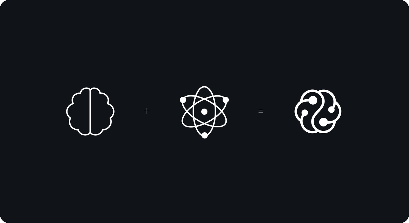
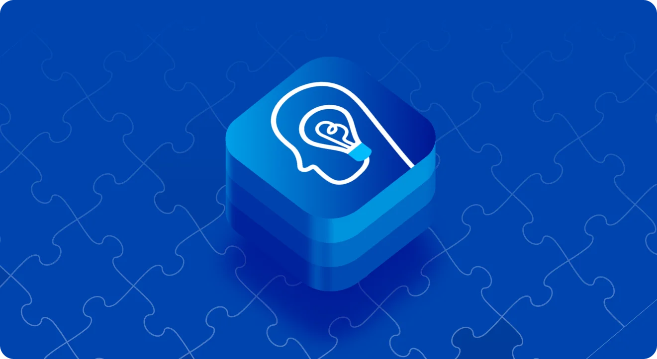
The atom, with its concentric rings and intricate structure, symbolizes complexity and curiosity, much like the challenging puzzles and rebuses within the app. On the other hand, the brain represents intelligence and problem-solving, emphasizing the mental engagement and critical thinking required to tackle these puzzles. Together, they form a cohesive visual that encapsulates the app’s focus on intellectual challenges and mental relaxation, making it an enticing choice for those seeking both stimulation and leisure in their mobile applications.

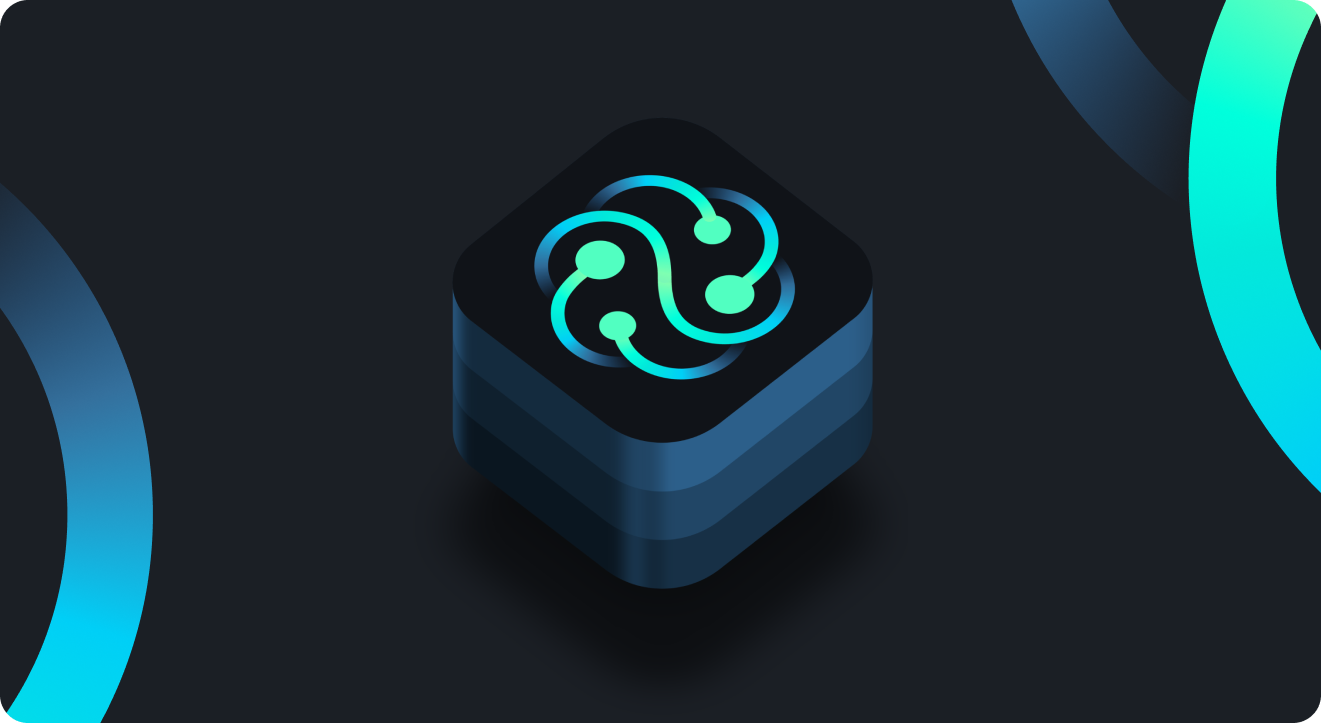
Crafted in tranquil dark hues background and gradient mint symbol, this icon exudes a sense of calm, inviting users to unwind and immerse themselves in a realm of riddles.

Results

New design improved app icon relevance and enhanced store listing appeal. It allowed to reach +64% of installers, 65% of organic installs and 12% of CVR.

Cases that you might like
Relaxing rebuses
Relaxing rebuses
The client contacted our experts to improve their marketing strategies due to high user acquisition costs. The decisive part was…
Brain training puzzles
The current app icon had a number of significant problems, such as low visibility
and non-descriptive concept, so the client approached…
Task-Manager & Daily Planner
The client sought to develop a robust ASO strategy for long-term effect. Since the category is dominated by similar, simple…
Sudoku puzzles
Sudoku puzzles
In a highly competitive environment, the client needed to create a strong App Store Optimization strategy that would yield results…
Get in touch
Let’s Talk!