



Task-Manager & Daily Planner
What we did
  • Research
  • Competitor Analysis
  • ASO Redesign
  • A/B Testing
Team
  • Project Manager
  • Art director
  • Marketer
  • Designer
Client
  • Task-Manager & Daily Planner
Location
  • USA
Duration
  • 1 month
+148%
Installers
x2,2
CTR
72%
CVR
Tools
About project

The client sought to develop a robust ASO strategy for long-term effect. Since the category is dominated by similar, simple features, the main challenge was to differentiate and emphasize unique benefits with fresh visuals, which would lead to higher CVR and CTR in the future.

Goals
  • Increase Conversion Rate
  • Increase Click-Through Rate
  • Establish Long-Term Brand Differentiation
Research

Competitors’ icons often incorporate elements related to productivity, organization, and time management. Common symbols include checkmarks (representing completed tasks), calendars (indicating scheduling or planning), clocks (for reminders and deadlines), and to-do lists (symbolizing tasks).

Simplicity wins: the best apps strike a balance between functionality and simplicity. New screenshots should prioritize user needs: effective task management, reminders, and organization are at the core. Also new visuals should evoke positive emotions—whether it’s a sense of productivity, calmness, or motivation.

Icon design

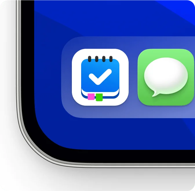
The main tasks of creating the new icon were to effectively convey the purpose of the app and visually distinguish it from competitors.
The use of bright colors and simple but effective images makes the new icon visually appealing. The notepad is an instantly recognizable symbol associated with task and productivity management. The check mark reinforces the idea of completing tasks, which is perfectly aligned with the purpose of the app and reinforces a positive experience or result.
The new icon attracts attention, communicates functionality, and reinforces brand identity.

Screenshots

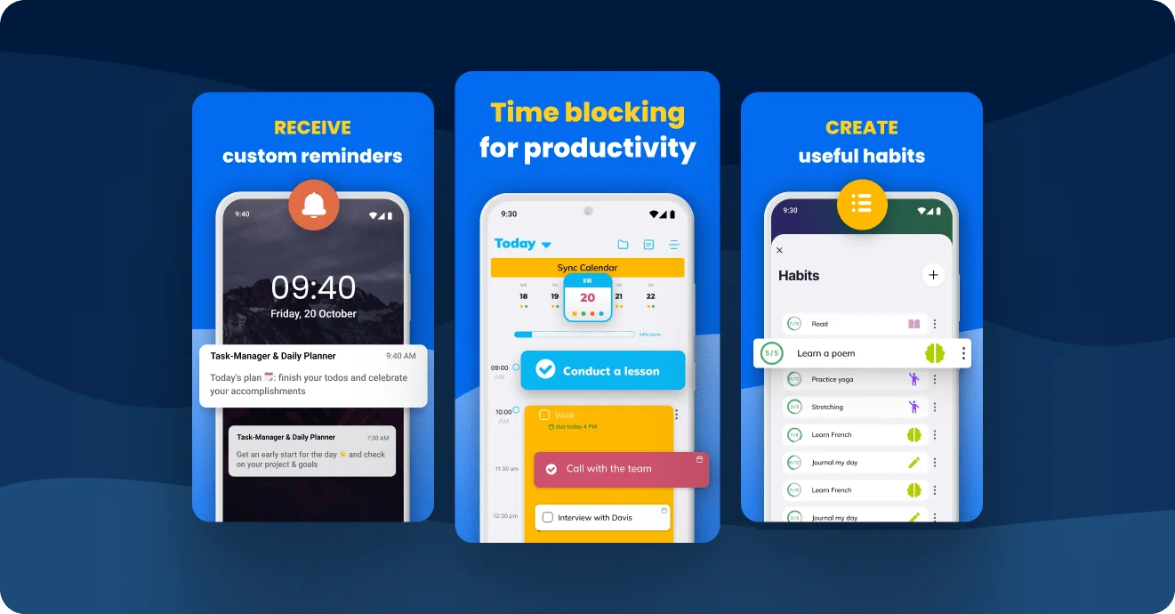
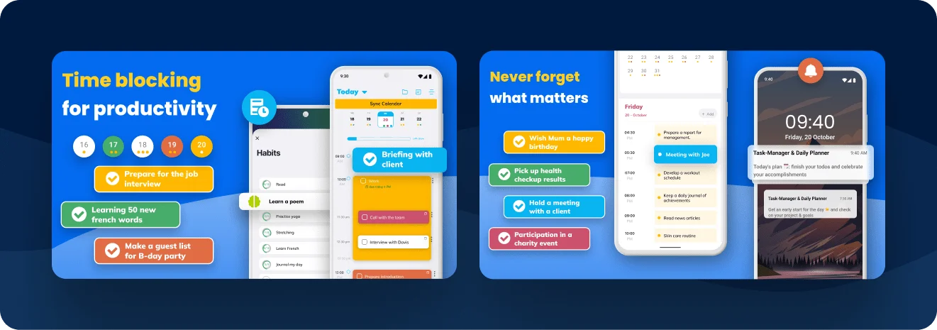
The first screenshot in the new set showcases time blocking, where users can allocate specific time slots for tasks or activities. This feature is the main app benefit as it helps users organize their day effectively, making it a powerful tool for productivity.
The use of colors helps differentiate between tasks, categories, and features. The use of icons simplifies complex text understanding and reduces cognitive load.
New screenshots tell a comprehensive story about the app’s features. Potential users can quickly grasp what the app offers without reading lengthy descriptions.

Results

The significant increase in installers (+148%) indicates successful optimization. More users are discovering the app, which is crucial for growth. The optimized visuals and messaging contributed +72% of conversion rate.
By focusing on design and visual elements, the app has established a unique brand identity. Consistent branding and highlighted app benefits will help the app stand out in the long run.

Cases that you might like
Relaxing rebuses
Relaxing rebuses
The client contacted our experts to improve their marketing strategies due to high user acquisition costs. The decisive part was…
Sudoku puzzles
Sudoku puzzles
In a highly competitive environment, the client needed to create a strong App Store Optimization strategy that would yield results…
Task-Manager & Daily Planner
The client sought to develop a robust ASO strategy for long-term effect. Since the category is dominated by similar, simple…
Brain training puzzles
The current app icon had a number of significant problems, such as low visibility
and non-descriptive concept, so the client approached…
Get in touch
Let’s Talk!